Poster Designer
Typography Class
Winter, 2024
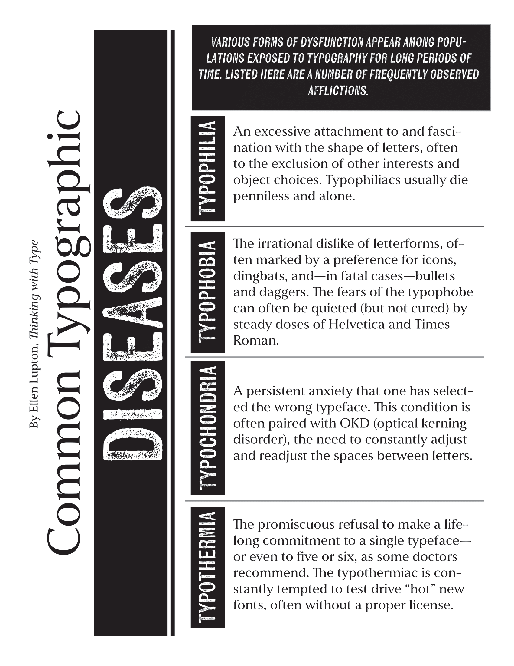
This project was my introduction to typography project and my first time using Adobe InDesign. For this project, we had an existing text template that we needed to use, but could be placed in any order we saw fit. We were not permitted to use color and were instructed to instead focus on values.
My job was to create a poster containing all the necessary dialogue using only a greyscale color palette.
This project required my to limit my scopes. The text, color palette and the poster size were all already decided. Instead, I had to focus on the way words were arranged as well as the fonts I used.
One of my largest problems was figuring out how to actually get all of the words onto the page. The font size has its limits and can be no smaller than 12 point or it'll risk its readability.
I also needed to figure out how to make the poster visually interesting and eye caching without the use of strong visuals or color.
I opted for the approach of turning some of the large, heading words vertical to give myself more horizontal room. This has the bonus of being visually unsual and drawing the viewer in.
I also opted for a font that has a lot of texture and feels dirty. This dirty feeling helped tie in the idea of diseases without having to literally draw a representation of the diseases as well.