Brand and Advertisement Designer
Crystal Connect (Fictional Company)
Winter, 2024
For my winter term at Pierce, my class was tasked with creating a fictional company. This fictional company would need a name, logos, and advertisements. We were allowed to make this company as fantastical or realistic as we desired. I opted to make a fantasy company. Crystal Connect exists in a world of magic where crystal balls have been refined into portable tablet. These tablets aren't commonly used yet and mostly belong to adventurers who are part of adventurer guilds. These tablets allow the user to contact their guild masters and families from anywhere in the world, allowing them to easily report back any finding, request for assistance, and show their families that they are safe.
The first step to creating this brand's image was to decide how the brand should look by developing a mood board.
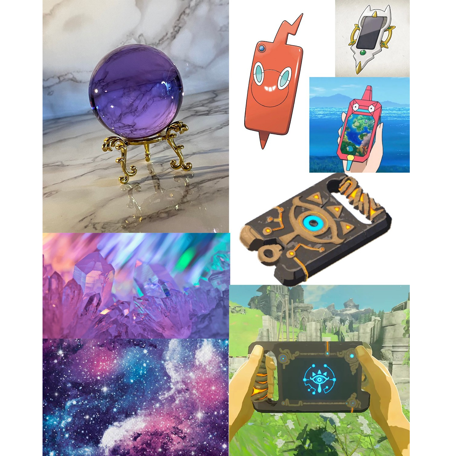
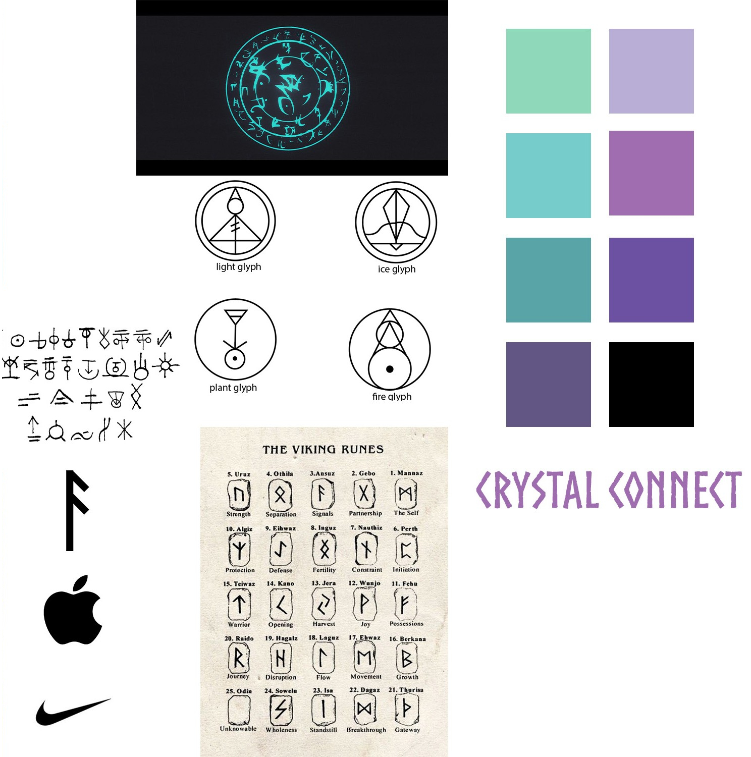
The tablets are based off of crystal balls being made pocket sized and portable. Crystals and crystal balls are generally depicted as being made of either clear crystal or amethyst. To represent amethyst crystal balls, shades of purple were selected as brand colors.
Of course the brand would also need accent colors. I opted for a greenish-blue. When thinking of magic, different colors tend to associate with specific types of magic. A bright green is usually nature and healing magic. White is light or holy magic. This greenish-blue feels like a magical color when paired with purple, but is also relatively nuetral in connotations.
When thinking about how the tablets would work, I had latched onto the idea of them functioning through magical runes. These runes serve as the 'code' that each of the tablets run on. Ansuz in particular is the rune for communication; it is the one that looks like half a pine tree, or half an arrow with two points. This would become the main rune that I would use when creating the brand's design. Additionally, I opted fo the font 'Nordic' because of how it resembles runes and provides that old, chiseled text look.
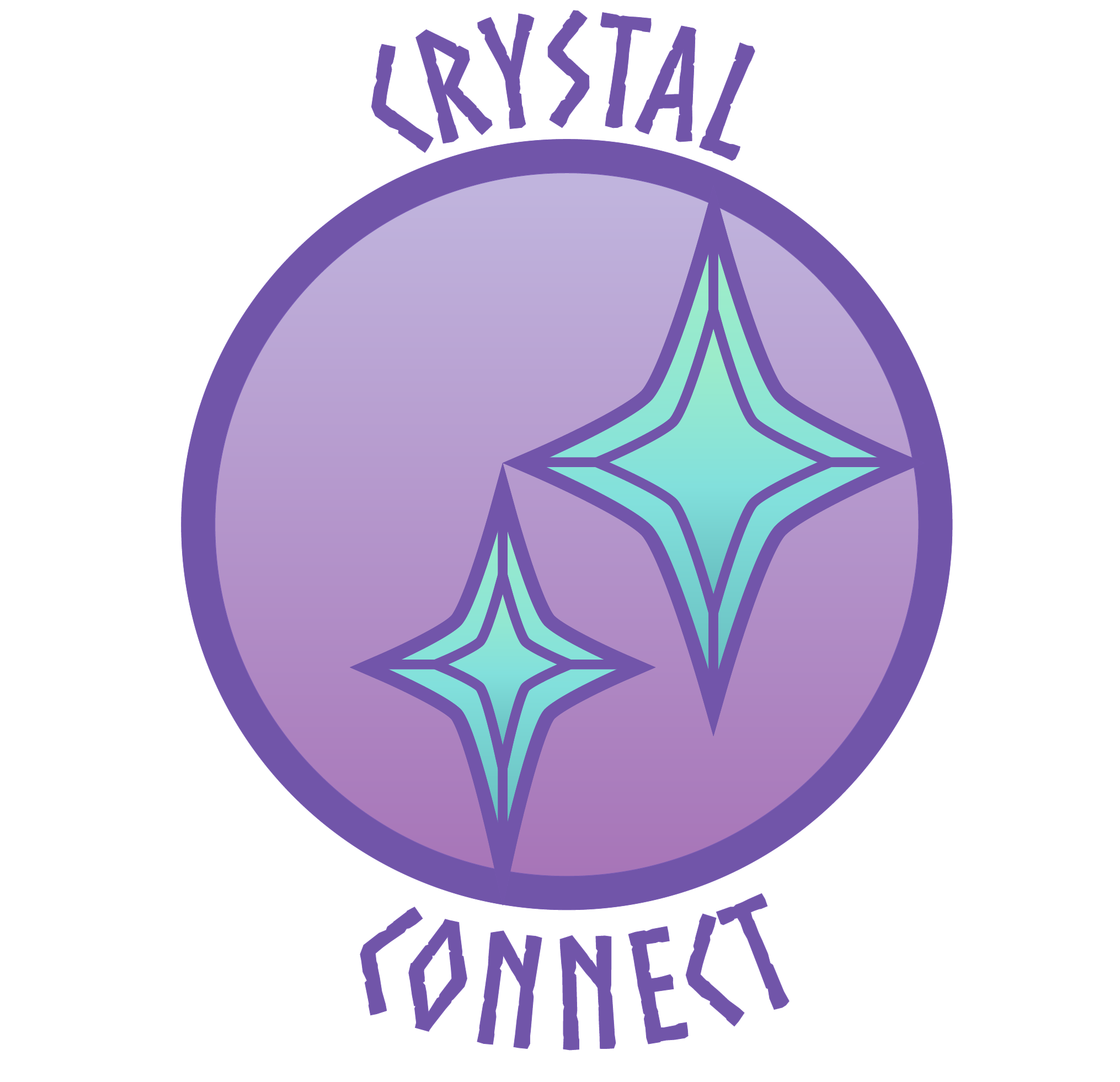
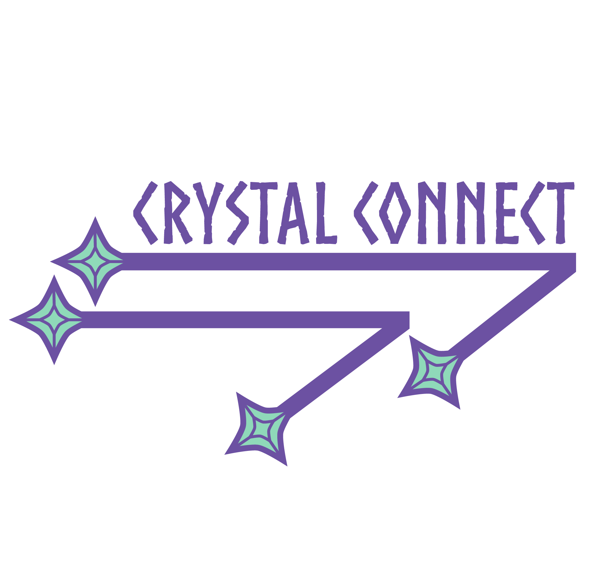
The brand needed two logos. One combination mark logo and one wordmark logo. Each needs the name of the brand because the brand is too small to be immediately recognizable upon logo.
I started with the combination mark logo, though my process was more like an abstract logo with the name of the brand squeezed overtop. The logo consists of a circle with two star sybols in the middle. The circle represents crystal balls as a whole. It serves as the backdrop because it is a tool of the past, and the company product is the tool of the future. The two star symbols represent the crystal tablets. The crystal tablets connect in the middle at the point since they are meant to send messages to each other, but they also connect to the crystal ball in the back since they're cross compatable. The tablets are tools for communication and connection, and the goal was to show that while also appearing like a styalized crystal ball.
The wordmark logo uses the Ansuz rune through the shape on the bottom of the logo, showing how the brand is a tool for communication. Each end of the rune is tipped with a star-like gem representing the tablets communicating to each other. Additional, the logo is meant to resemble a circuit board since the runes function as the inner workings of the tablet.
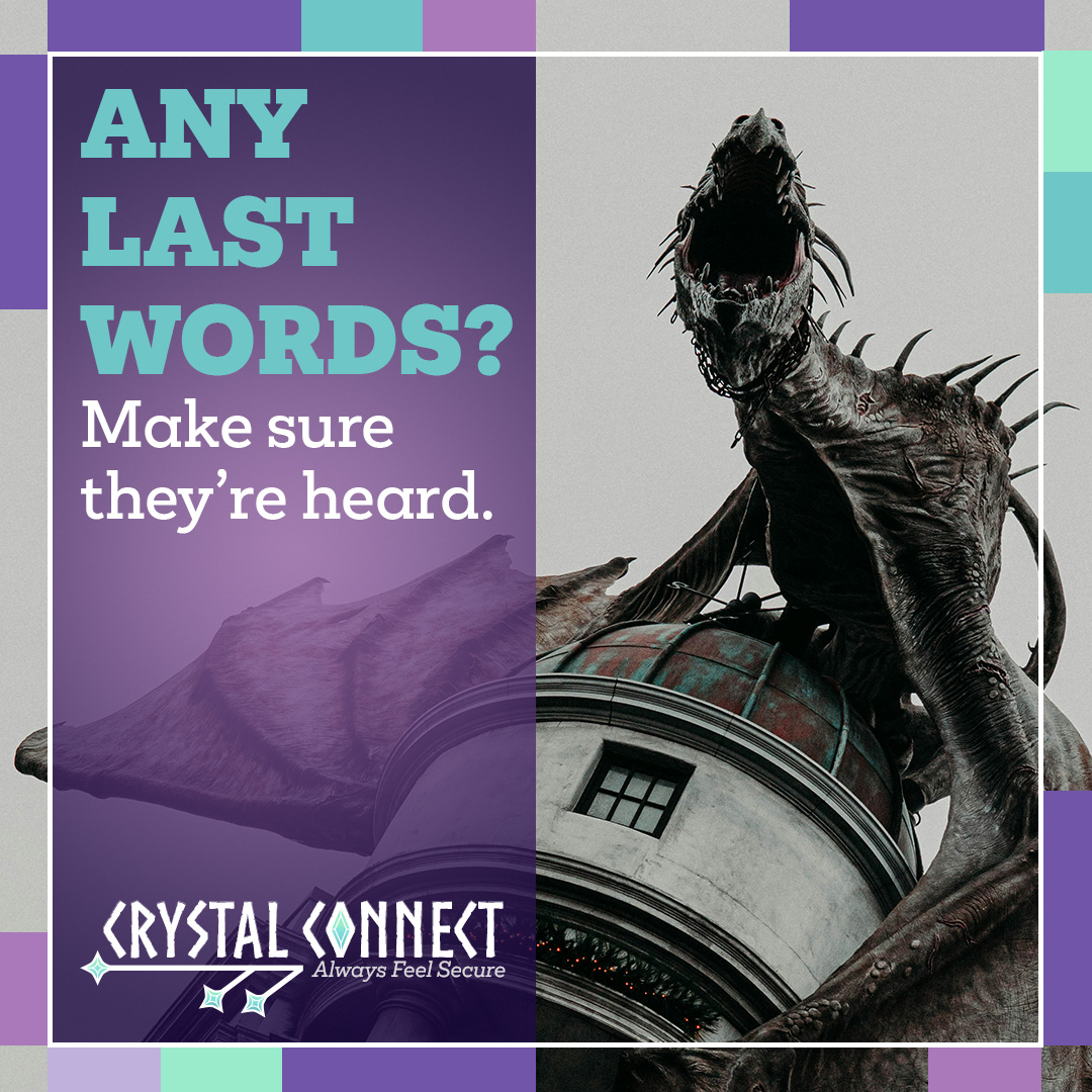
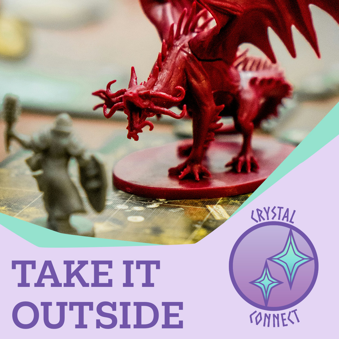
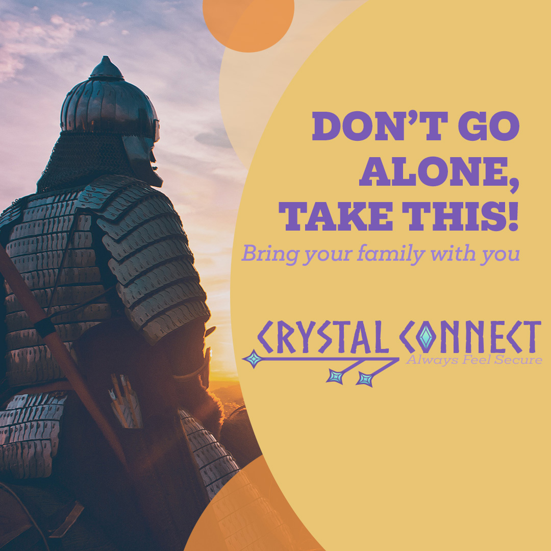
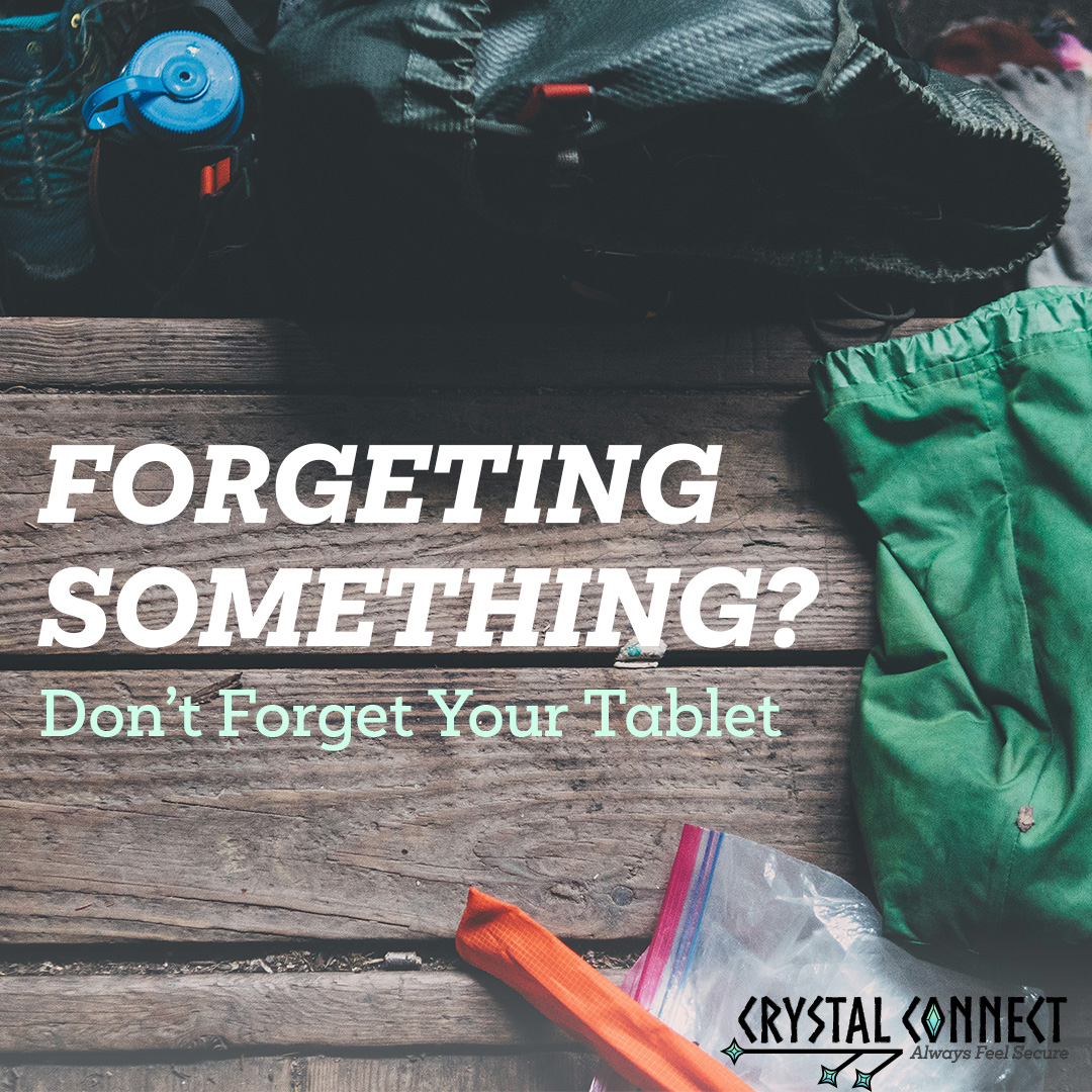
Next the brand needed some advertisements. These were all designed for instagram, so they required a quare design. We were also tasked with animating one of the advertisements we had designed, so I had opted for animating the dragon one shown above. These advertisements were meant to be made using stock imagery along with whatever designs we saw fit.
I ended up making four total advertisement designs, dubbed 'Dragon', 'Game Board', 'Knight' and 'Supplies.' Each has a different focus. Dragon focuses on the dangers of adventuring and staying in contact with loved ones. Game Board plays off of traditional DnD and the idea of taking those adventures safely outside. Knight is a person about to leave home and how the tablet can help them stay connected. Supplies is more of a reminder to bring the tablets when leaving.
Lastly was creating a poster to advertise the company. I ended up making two posters instead of one since I liked two ideas I had.
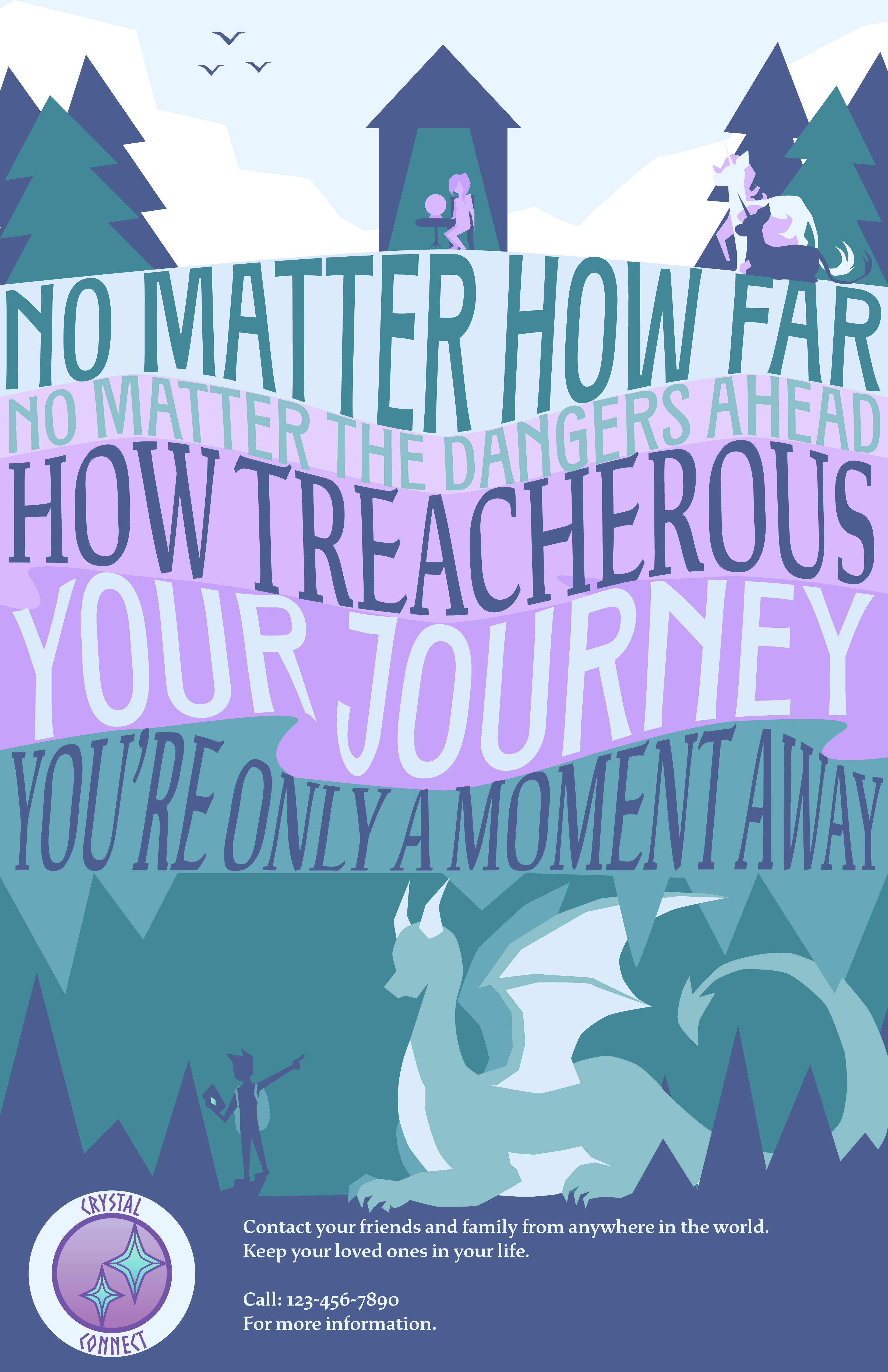
First came the cave poster. The idea was to show distance between a person and their home through the different layers of earth. Then to overlay the text onto those layers that help emphasize the distance. One person is an explorer, traveling alone while their loved one is waiting at home, wondering what they're up to. And, thanks to the tablets, the explorer is able to contact the loved one's crystal ball to show the discovery he's made, a giant, friendly dragon.
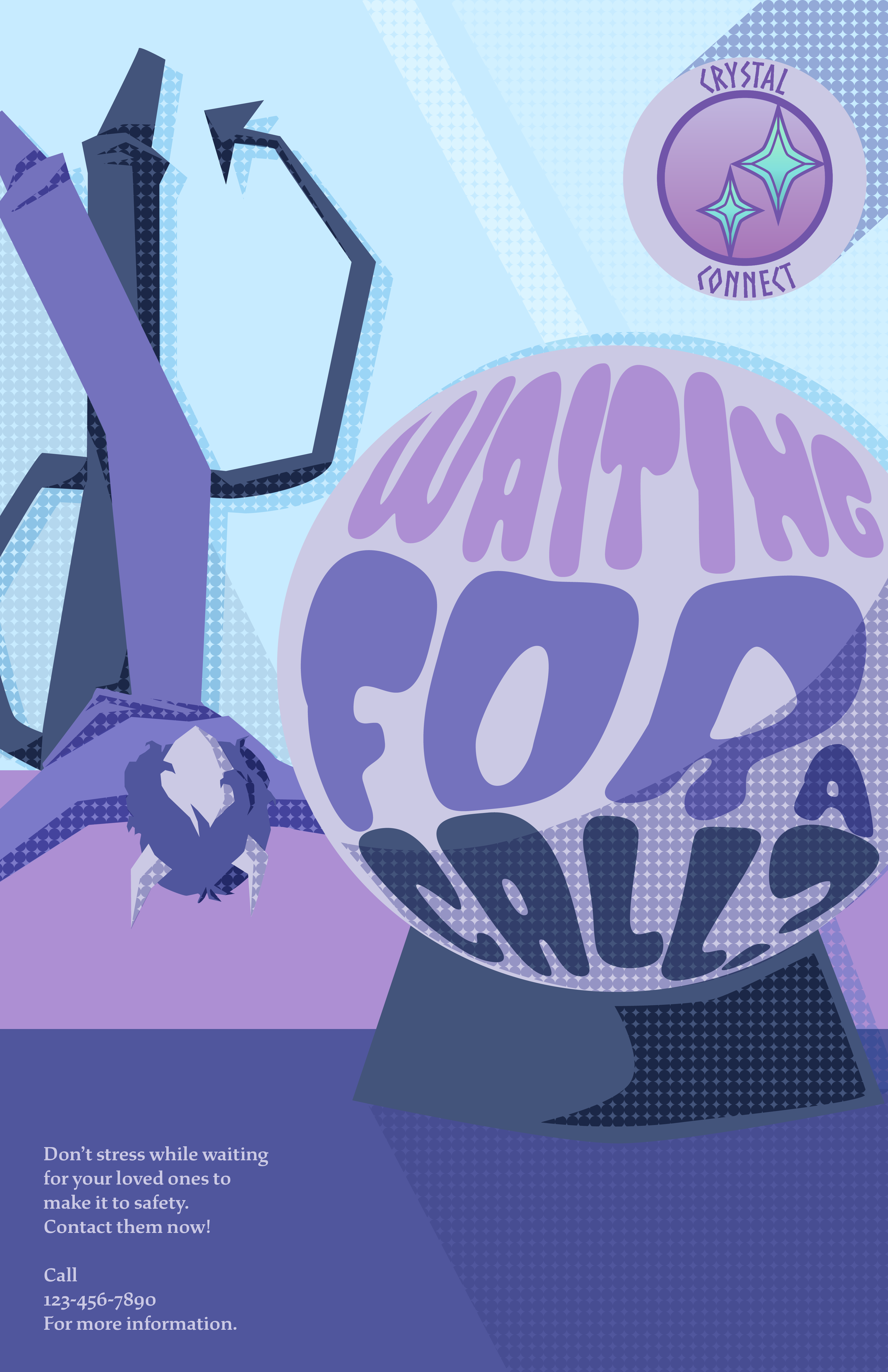
The second poster is mainly meant to focus on those who are stuck waiting at home while explorers are off on dangerous missions. For those at home, it's agonizing not knowing whether those they love are alive or dead, happy or in danger. They don't get contacted back until the explorer gets back to their guild where they can use the guild's crystal ball to make contact. The demon in the picture is bored and stressed, tossing and turning in bed while waiting for that call. I wanted to play around with morphing texts within shapes, as well as styalizing the shading.
In this project I needed to create a fictional company, develop that company's brand identity, and design the company's logo and advertising.
This project was ultimately an opportunity to learn how to use Adobe Illustrator, a program I had no experience with either. Every part of the project was new. I learned not just how to use the program, but also how to find resources for myself.
The challenges of this project mostly came in the form of it's limitations. Since we were using stock imagery and I didn't yet have the skills to design the phone for myself, all of the advertisements had to skirt around showing the actual product.
And when making the posters, I didn't have any guide for how to make things like the stylized shading. Any effects I wanted to do, I had to learn how to do on my own.
Instead of focusing on selling the product and what the product looks like, I centered my advertisements on what the product is meant to do for the consumer and why they should own one. This allowed me to use the stock images to instead convey an idea rather than a product.
Any guides I needed, I typically found on YouTube. Fortunatel there are many great sources for how to find things if you know how to search for them.